How to Start Using Semantic to Style React Applications
I had been meaning to explore the Semantic framework, and last week a React project provided the perfect opportunity to delve into the styling tools. In the past, I had utilized Bootstrap to polish a Rails application, but I was struck by the relatively painless start-up, intuitive syntax, and clean styling that Semantic provides. First, I will detail the steps required to install Semantic in a React application, then I will provide a few examples of Semantic styling. For the purposes of this quick start guide, I am assuming basic familiarity with JavaScript and React framework, and I am omitting custom styling outside of the defaults included in Semantic. If you already have Semantic imported in your project, you can skip to the second section of this post.
Semantic UI React Installation
To install Semantic in your project, navigate to your project directory and run the following command in your terminal.
npm i semantic-ui-react
To quickly get up and running with Semantic, you can import the default Semantic UI stylesheet by including this link in your index.html file.
<link rel="stylesheet" href="//cdnjs.cloudflare.com/ajax/libs/semantic-ui/2.3.3/semantic.min.css">
Here is the updated index.html file with the Semantic link:
Congratulations! This application now includes the default Semantic stylesheet and is ready to incorporate the desired styling components.
A Few Useful Examples of Semantic Styling
User Cards and Simple Buttons
First, navigate to the file containing your user cards component and insert the following line of code:
import {Card, Image, Icon} from "semantic-ui-react"
In order to use a specific Semantic styling tool, it must be imported using an explicit element name. As seen in the line of code above, you can import multiple styling elements at once. The Card element is well suited for user profile tiles and the Button component is a notch above the standard HTML Button tag. As a demonstration, I mocked up the Card below for a familiar character.

Here is the relevant code for the above Card:
Menu
The Menu element is another versatile Semantic styling tool. In one of my more recent projects, I used the Menu as a NavBar for the entire application. I provide basic code for a simple Menu below, but these can be further customized to respond to events and serve as links throughout the site. Additionally, as illustrated in my example, it is possible to create Menu groups inside of other Menu objects.
As before, import the Menu into the desired file using this line:
import { Menu } from "semantic-ui-react"
Example Menu:

Code:
Forms
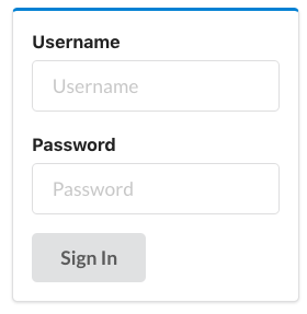
As a last example of Semantic styling, the Form element can be employed across your application to quickly create clean user-friendly fields. Although it is not depicted in the following example, forms can easily be configured to respond to user events.
Import it in your file:
import {Button, Form, Segment} from "semantic-ui-react"
Example Form:

Code:
I have demonstrated a few practical examples of Semantic UI React styling, but I urge anyone interested in learning the nuances of the toolkit to peruse the official documentation.